Announcing: Data Bake Off
In a salute to Saku Chandrasekara, 2023 Great British Bake Off contestant and one of Data Orchard’s founding directors, I’m delighted to share our new creative resource for unlocking hearts and minds around data: the Data Bake Off.
We know one of the biggest challenges for people in data roles is engaging staff in conversations around data. And you can’t beat a bit of in-person fun and creativity for getting people started. So, here’s a recipe we’ve cooked up to get the juices going… We can deliver and facilitate this fun data workshop for you and your team(s), but we’re also sharing the idea here, so you can deliver it yourself.

Saku Chandrasekara. Credit: The Great British Bake Off, Channel 4
How to: Hold a Data Bake Off
Ingredients
You’ll need:
Ideally, 25-30 people, working in groups of around 6.
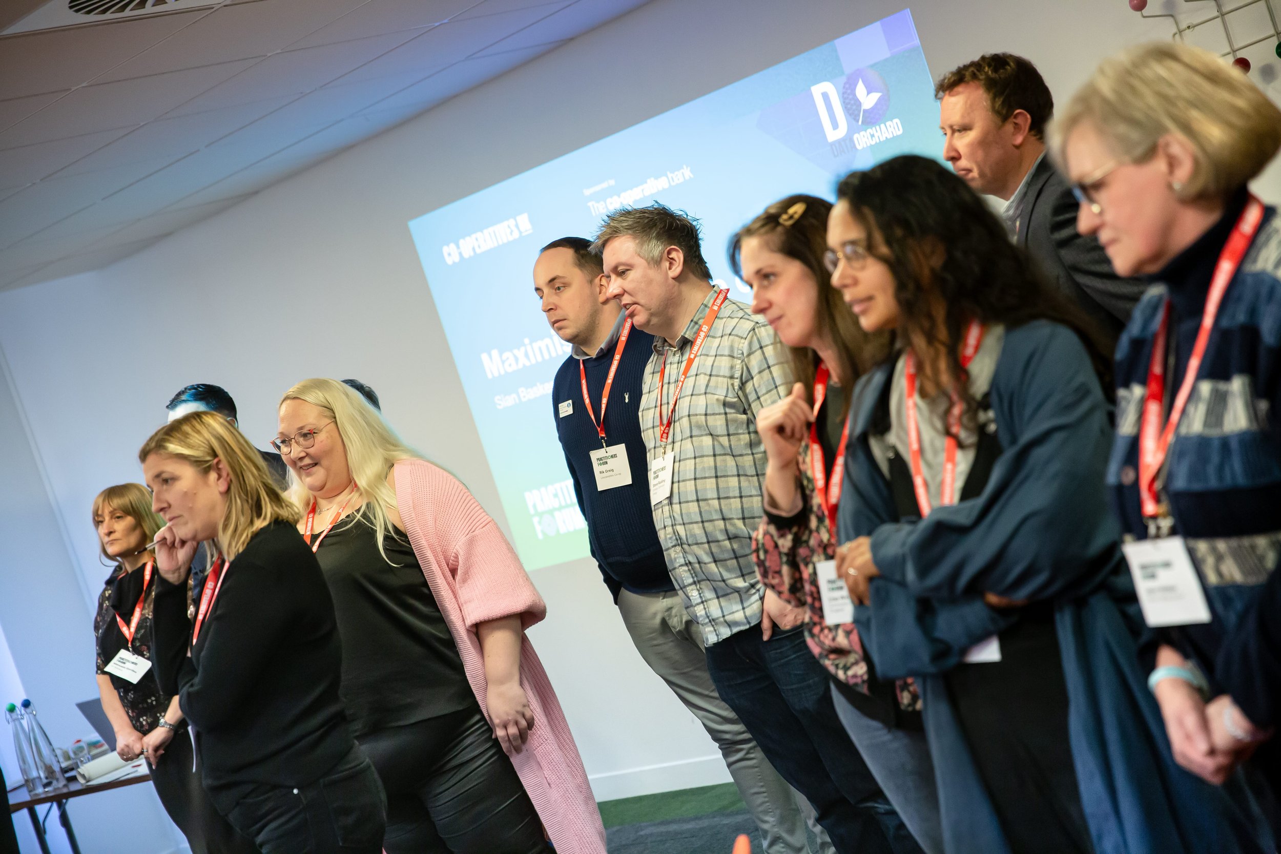
A theme. For this example I’m going to use ‘impact’ which I used in my session on ‘Maximising the value of your data’ at the UK Cooperatives Practitioners Forum in November 2023.
Some A1 flip chart paper (pre-prepared - see exercise 2)
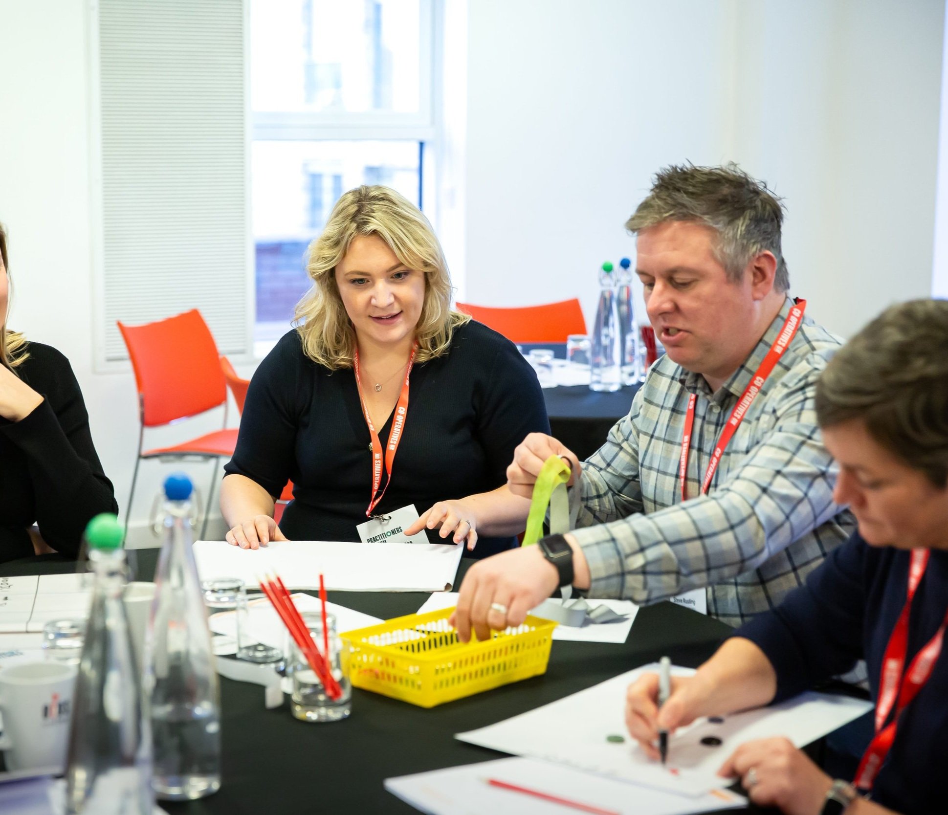
A basket of creative materials per table (scissors, glue dots, ribbons, buttons, pens, wool).
Some A3 paper (plain)
You’ll ask your participants to work through three exercises, inspired by the three challenges contestants face on Bake Off. I’ve used different names here (because the Bake Off challenge names are trademarked) but if you’re a Bake Off fan, they should feel familiar ;-)
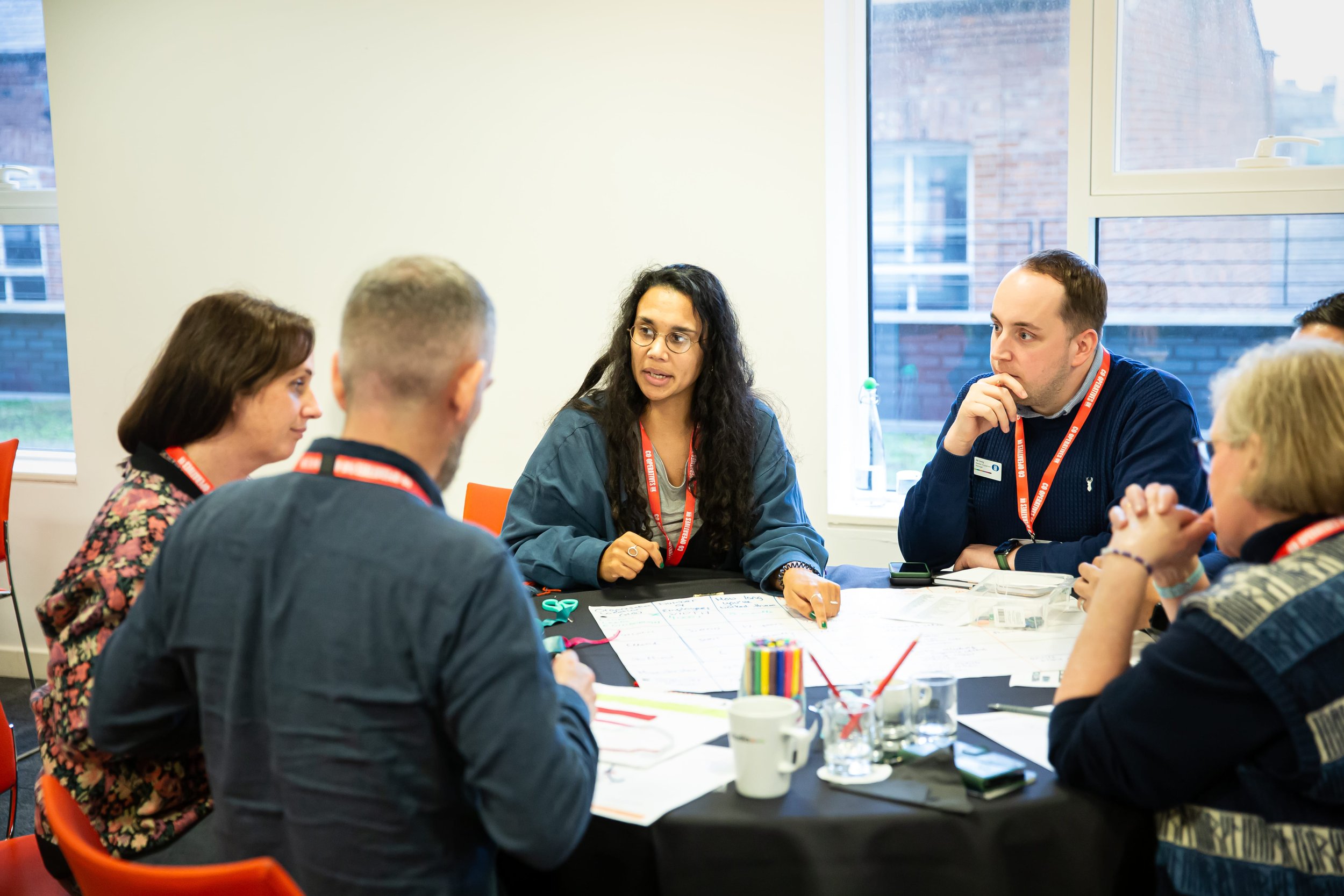
Exercise 1: Tried and Tested Recipes
The first challenge is always a bit personal and encourages people to unveil their well-rehearsed recipes. In this case, it’s about getting people to think about the data they do and don’t collect. With a theme of ‘impact’ I introduced the five types of data (from NPC):
User data
Engagement data
Feedback data
Outcomes data
Impact data.
I asked participants to write down for each:
What data they collect that’s really useful
What data they don’t collect but wish they did.
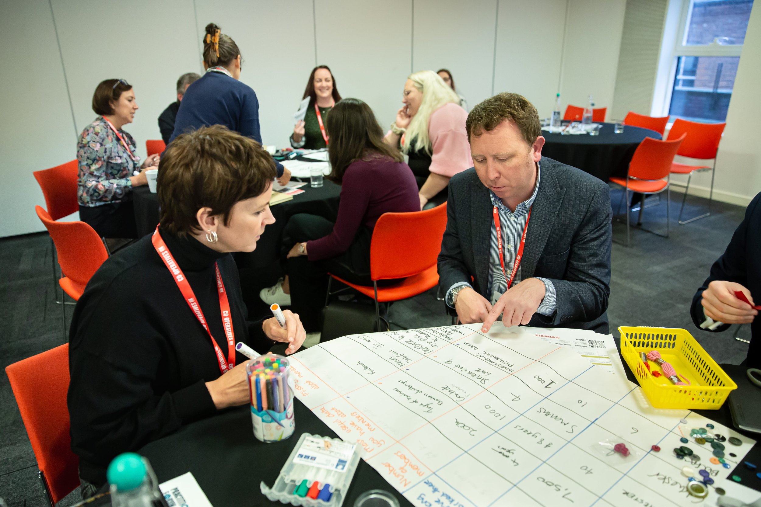
Exercise 2: Data Gathering
In this round, things get more technical. This is all about asking people to focus in and gather actual data. On an A1 flip chart it’s just about possible to collect six rows and six columns of data. You’ll need to pre-prepare your A1 sheet with the column titles showing the data you want to gather. It’s important to include some easy wins that people can quickly fill in (and don’t take up much space) and some that are going to be harder and likely to elicit some debate. Ideally, you want some geographic/location data, some numeric data, and some temporal (time-related) data.
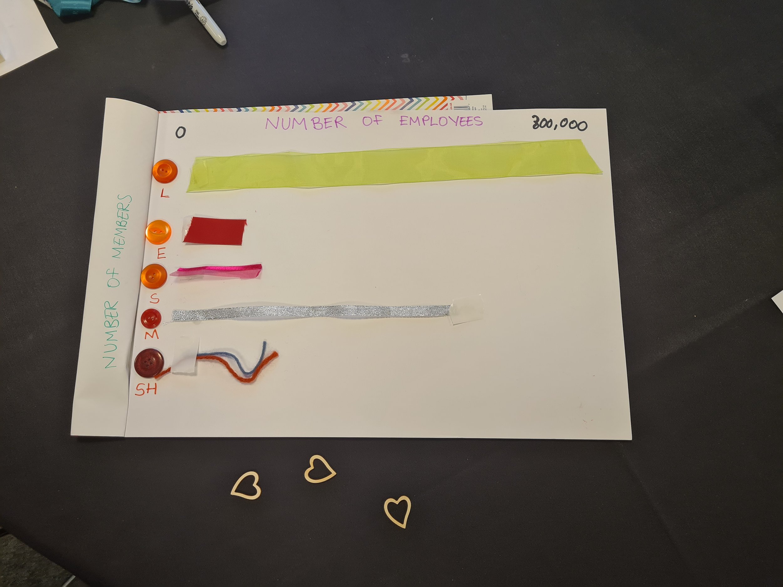
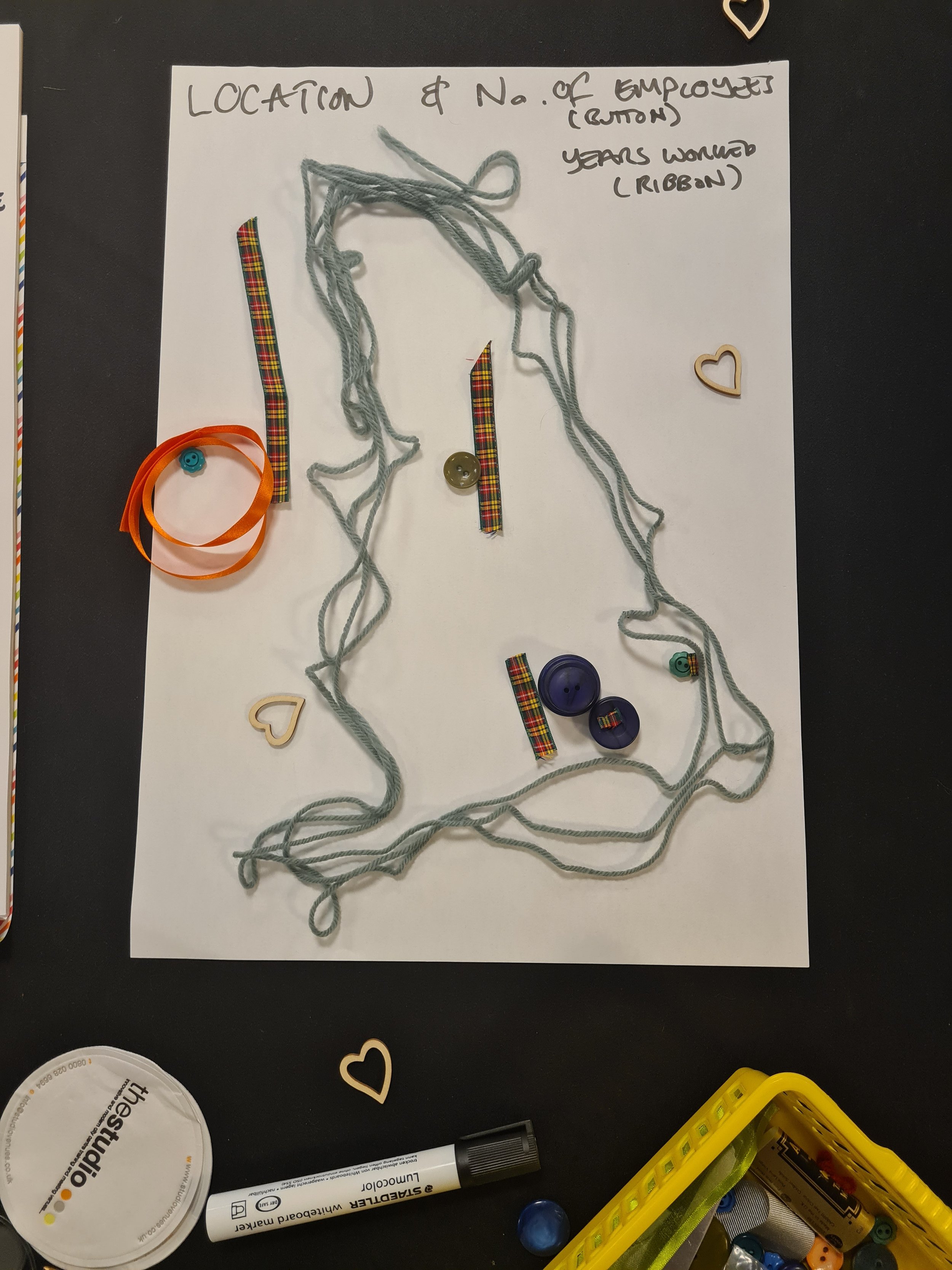
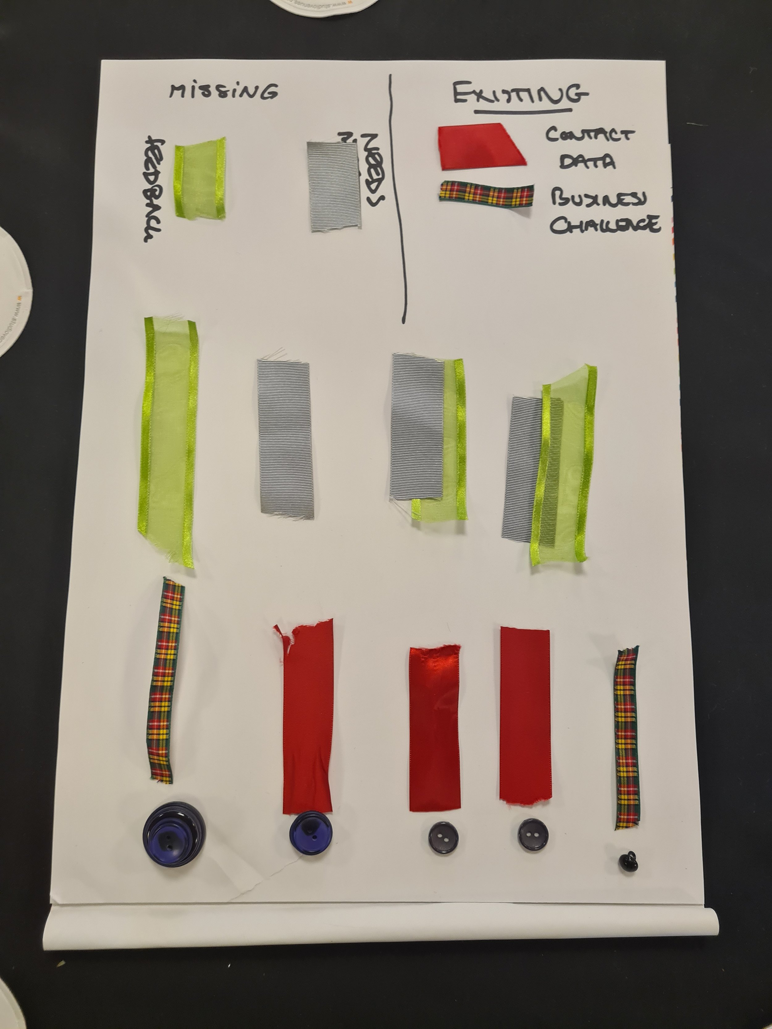
In the UK Cooperatives workshop, I was working with attendees from different organisations, so asked participants to think about organisational data. For easy wins we collected: organisation location, number of employees, how long participants had worked in their organisation and number of members. For the trickier data, we got them to use their responses from the signature dish ‘Most useful data you collect about members’ and ‘Missing data you wish you collected’.
If you’re working with participants who are all from the same organisation, you could think ‘down a level’, such as team size, how far they travel to work, service user/client data.
The exercise is less about the data itself, and more about aiming to draw out discussion around the challenges of data collection. For example, when I asked how many members an organisation had, the question assumed all the people around the table worked in organisations that have members. Whilst many did, some did not, or had different descriptions/structures. Similarly, some may use different units for data, for example people employed less than a year will describe how long they’ve been in their job in ‘months’, whilst more long-serving employees are likely to use ‘years’. These types of conversations can emerge just as often with internal audiences – often different teams, or even individuals within the same team, will think about and record the same data in different ways.
When you move on to the trickier data, this is most likely to appear as text for which patterns/similarities may or may not be apparent. In some cases there might be some gaps where people just don’t know (especially with the missing data).
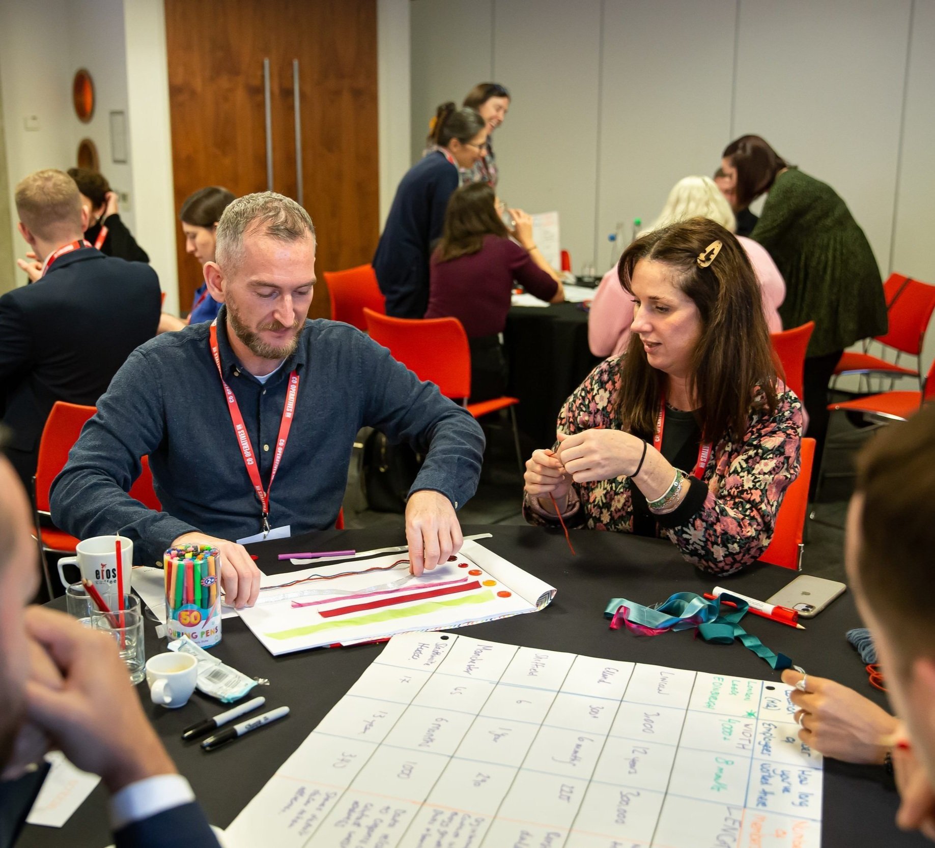
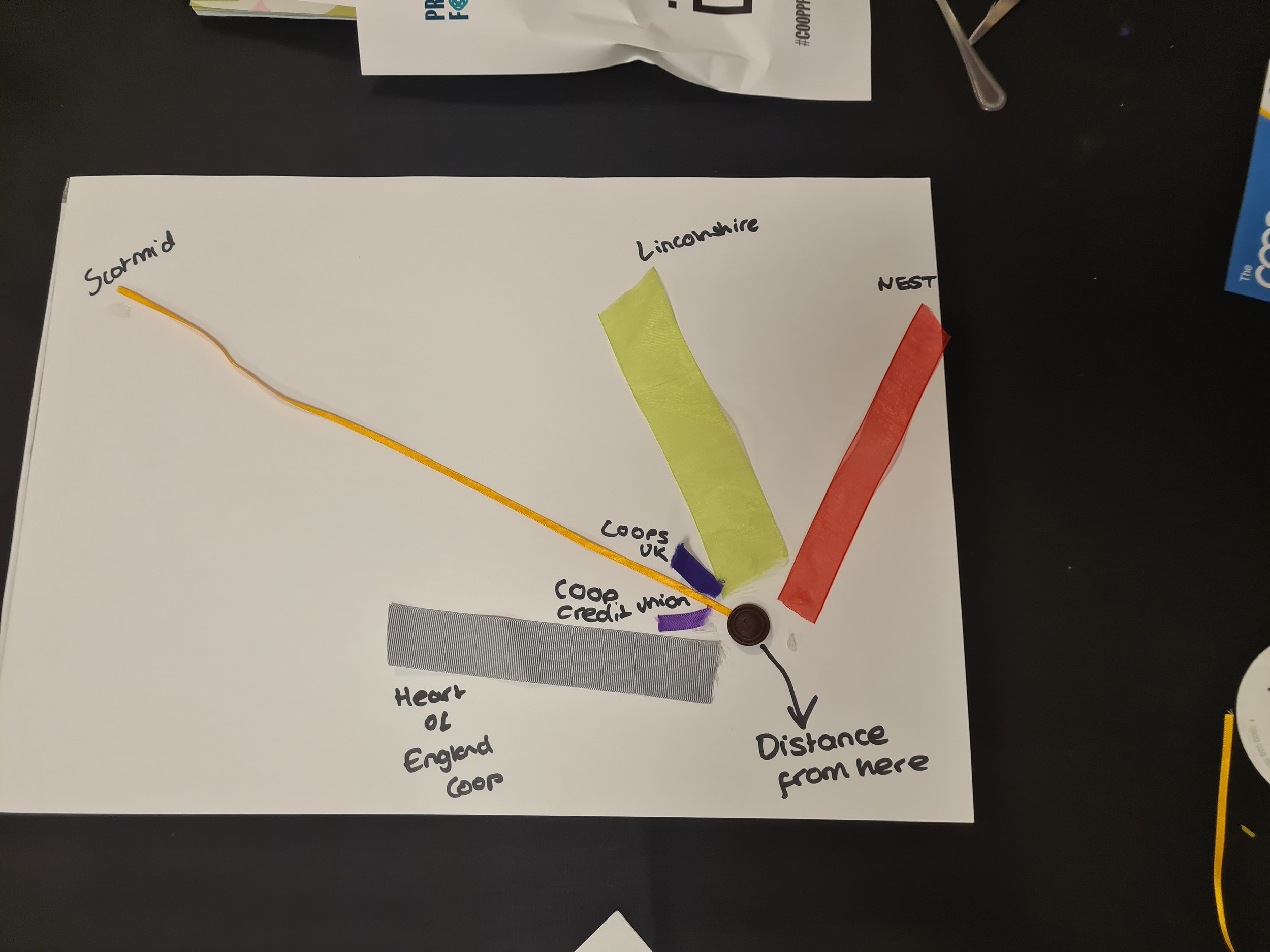
Exercise 3: The Finale

The finale is where the creative juices really start to flow, and everyone does their best to produce a visualisation of their data that will stop people in their tracks. For this exercise, you’ll need to provide materials. Ribbons, wool, and buttons in different sizes and colours make a perfect mix (I got mine from the ECHO’s charity shop which specialises in reclaimed textiles and haberdashery).
Depending on how much time you have, you could ask teams to make just one or several visualisations. Twenty minutes is about the right length of time to get them to think and produce their visualisation. Having the clock ticking will create a sense of urgency.
The Judging
Once all the tables have produced and selected their best visualisation/s, it’s time for the judging. You’ll need to give each participant a token (I used recycled wooden hearts) to take on a tour of the other tables. This gives everyone the opportunity to view all the other teams’ visualisations and vote with their heart for their favourite one. (It’s important to say teams can’t vote for their own.)

One of the more popular visualisations at the UK Cooperatives Practitioners Forum
To round things off, you might want to invite people to share their thoughts about what was good about the winning visualisation and you also might want to provide a small prize for the winning team. Or you could gather all the visualisations together to create a grand dashboard of everyone’s efforts.
What next?
We would love to hear back from any of you who try out ‘Data Bake Off’ (or other exercises) with your teams/members.
If you would like to book Data Orchard to come and deliver an in-person Data Bake Off workshop for your staff or network do get in touch. We also offer a range of online workshops to build data culture and data literacy.
Watch out for a how-to on our Data Task Master workshop next!

There’s nothing more satisfying than producing a great piece of data viz!